
Velocity: from a product link to a video in one click
An AI tool that turns an e-commerce product link into a video. The soft launch brought people in. Most of them left. This is how we found out why.
About Velocity
Company: Avataar.ai. Role: Product design. Duration: 2 months.
Velocity is an AI powered URL to video generator for e-commerce products. Paste a product page link and it builds a product video. The goal was better product discoverability and faster iterations on marketing ads, all from a single click, for people with minimal tech or creation skills.
We did a soft launch to test the waters and learn from early adopters.
The problem: people came, then left
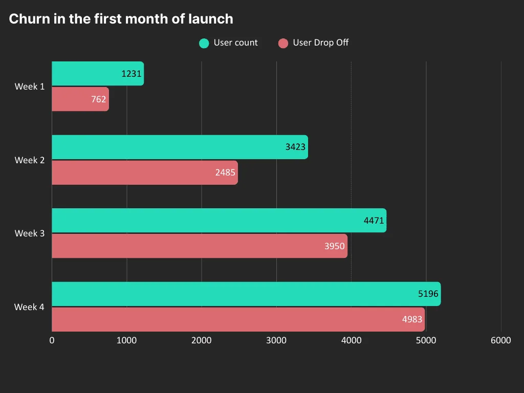
After the first month, targeted marketing and managed sales were bringing users in, but churn was significant. 96% of users dropped off entirely within 28 days, and over 60% dropped off after the first use.
| Week | New users | User drop off | Churn % |
|---|---|---|---|
| Week 1 | 1,231 | 762 | 61.9% |
| Week 2 | 3,423 | 2,485 | 72.6% |
| Week 3 | 4,471 | 3,950 | 88.3% |
| Week 4 | 5,196 | 4,983 | 95.9% |
We used a strict definition of drop off, since the product was new: a user who had no more than one session in their first week and none in the weeks after.
How we looked for the cause
I set out a plan to understand the problem before fixing anything:
- Check existing data: landing page to sign up CTR, videos generated per person, total downloads, and likes per video.
- Watch full session recordings for at least 10 chosen profiles.
- Recruit 10 users, known churned users and prospects, for an incentivised interview, and watch and listen as they used the product.
- Solve each problem on its own, to improve overall usability step by step.
What we found
From the data:
- 40% of users did not create a video after sign up.
- Many created a video but never viewed it, because generation took a long time.
- People clicked Regenerate a few times but never downloaded a video.
- Generated videos got more dislikes than likes.
From interviews: most people who signed up were performance or e-commerce marketers (over 50%) or small business owners selling a niche product line (over 30%). They came for the single click promise: no need for an agency or UGC creators. But the copy in the videos did not speak their product's language, the colours did not match their brand and could not be changed, and people who did not sign up never understood what they would get. Both groups wanted videos that fit the ad tools they already used, like Meta Ads.
The initial SUS score was 48.
Choosing three problems
The list of possible fixes was long: a try before login, sample links, better copy, better images, light edits, ad tool integrations, and link failures from some marketplaces. I picked the three with the best chance of moving the numbers:
- Discovery and pre sign up: let people create one free video before signing up.
- Output quality: improve text generation, image generation and template selection in the agentic AI pipeline, with rules that fit the target audience.
- Small edits: a simple editor for text, images, audio and voiceover, easy enough for a marketer or small business owner.
1. One free video before sign up
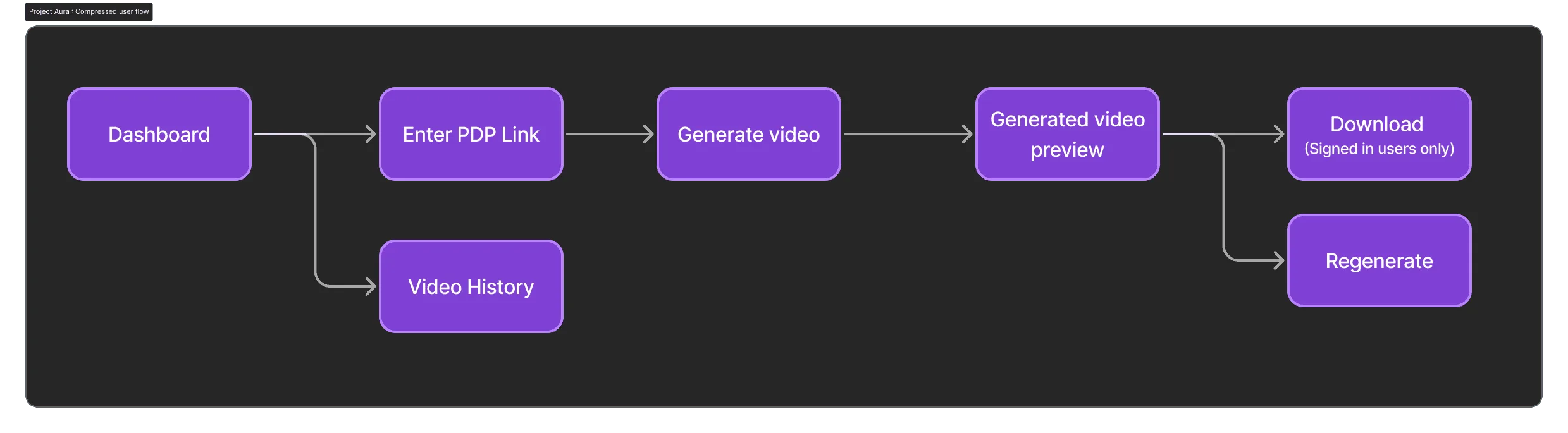
Users already got 50 free credits after sign up. I made the case to stakeholders that one free video before sign up would show people what the tool does, and they agreed it was worth trying. The flow had to stay simple for low skilled and exploring users. I made quick wireframes, ran static tests, then moved to visual design.
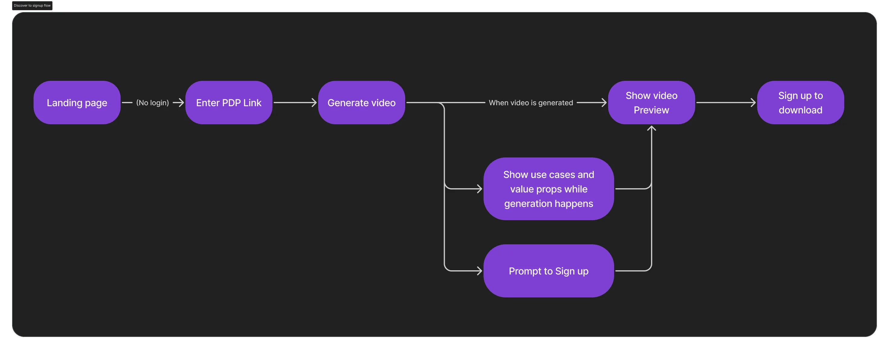
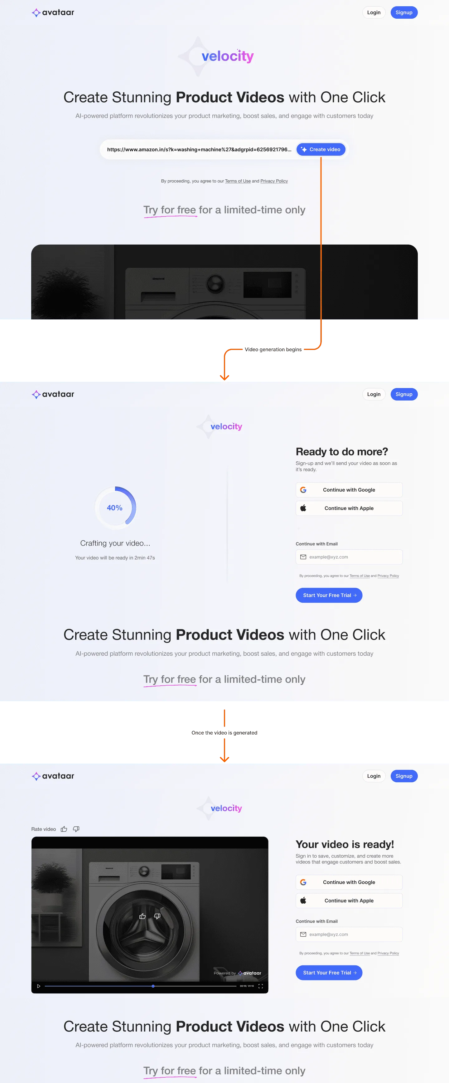
Each generation cost the company $0.2, so downloads stayed locked until sign up, and the free video was limited to one per device to stop misuse. Success was measured as lead conversion from discovery to video creation, and from discovery to sign up.
2. Making the AI pipeline fit the user
The pipeline had to choose the right templates, colours and text for each product without hallucinating. Motion designers on the team made more templates for the agent to choose from. To test phrase generation, we built a prototype that generated phrases from scraped product page data, had an LLM score each phrase on 8 parameters, and then asked 10 relevant internal and enterprise users to score them on a fixed, diverse set of product pages. A second prototype A/B tested two models with 8 to 10 target users.
We also needed templates annotated by product type, which needed a better annotation tool, and colour logic that followed the product's own colours.
3. A minimal editor
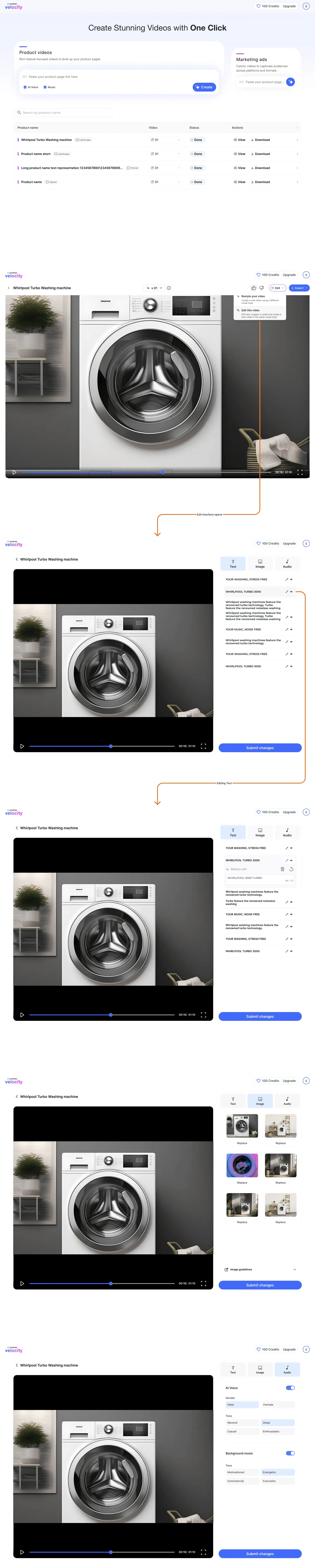
Our users were not creatives, but they had an eye for quality. They wanted quick results, not a full video editor. So the editor covered only text edits, image edits, and simple choices of audio genre and voiceover theme.
Outcomes
- 70% of people landing on the page created a video before logging in.
- 40% of people landing on the page logged in, up from 6%.
- Over 20% of users used the edit feature before downloading.
- The SUS score rose from 48 to 64.
- Claude 3.7 wrote more consistent marketing copy. Gemini 2.0 was more creative but hallucinated unwanted text.
- Performance marketers liked the better videos but wanted more control, like a brand kit.
What came next
The backlog included a confidence score, a brand kit, thumbnails, better version history, more ad manager integrations, better marketing copy, and a stronger template creation and annotation pipeline.
Send a connection request with a short note about what you’re working on.
Connect on LinkedInGitHub